Preference Capture Widgets

What are preference capture widgets?
A preference capture widget is a tool which allows you to capture customers permissions and preferences. This can be done directly by the customer themselves, or by your staff from within your own systems (most modern CRMs can accept custom code).
The mechanism for this is to embed a javascript snippet (as described below) in your website / form / portal / app / system. This triggers a script to run which pulls through the desired permissions and preferences to be presented from the capture template.
Our experience of helping customers integrate their systems and business processes with DataGuard have shown that the most common elements to consider are:
- Collecting consent and applying permissions at sign-up without creating up-front records
- Providing a 'My Account' portal or 'Manage All' page with the full permissions & preferences input available
- Ensuring unsubscribe from email flows correspond to granular permissions in order to avoid blanket opt-out
- Embedding a seamless DataGuard view to your CRM to allow staff to manage permissions from your source system
- Synchronising the current state from DataGuard to drive marketing activity based on accurate permissions and preferences
- Evolving to progressive consent, prevent consent fatigue and capturing targeted permissions
The steps below show how to embed the basic capture point (known as Collect+), and how to amend key config elements to tailor the look and feel to suit your requirements. This code is the basis for all contact points, in order to layer in additional functionality please review the relevant sub-page.
How to embed a capture point
- Add an Id to an element to to the host html that relates to where the capture point is to be embedded.
- Include the script below in the page. The load object options are explained in the next section.
NOTE - UseStatefulWidget.loadwhere a DataGuard record already exists and the current state should be displayed to the user. UseStatelessWidget.loadwhere no record exists and current state is not needed (e.g. for sign-up flows that don't create DataGuard records up-front).
<script>
  window.addEventListener('load', function() {
    StatefulWidget.load({
      id: '< ELEMENT ID >',
      templateId: '< TEMPLATE ID >',
      token: token
      //ruleId: '< RULE ID >',
      //channel: '< CHANNEL >',
      //campaign: '< CAMPAIGN >'
    });
  });
</script>
<script src="https://scripts.consentric.io/capture-point.min.js"></script>
Environment Consideration
The above snippet is from the production environment. If you are using another environment you will need to change the script src to reflect that environment. E.g sandbox= "https://scripts.sandbox.consentric.io/capture-point.min.js"
Configuring the capture point
Id (mandatory)
The Id string of the element that the capture point should be embedded into. For example, you may wish to create a new <div> in your page. If you have a <div> that looks like:
<div id="capture-point-container"> the Id field would look like this: id: 'capture-point-container'.
Template Id (mandatory)
templateId identifies the content to be rendered. A sample template may have been created for you at outset when your sandbox is created (depending on your plan type). These can be provided to you by your solution consultant, or created via the DataGuard Admin UI here.
Each template consists of a series of configurable elements:
- Privacy Policy (mandatory)
- Permission Statements (required to capture permission transactions)
- Permission Options (required to capture permission transactions)
- Preferences (required to capture preference choices)
- Text Blocks (used to render additional text to capture point users)
- Text Override Elements (used to adjust the default copy that is displayed for various elements - e.g. the all/none toggle labels when using an alternative language)
Rule Id (optional)
ruleId is the id string for the set of rules that will be applied to the capture point. This is only required if you wish to capture progressive consent OR to apply mandatory responses (e.g. enforce acceptance of T's & C's). See how to create rules, and what your options are using our UI here.
Channel (optional)
channel is stored on the resultant permission transaction to indicate the means by which the permissions data was obtained. For example if the capture point was embedded into a form on your website a suitable value might be Webform. The channel value may be omitted, in which case the default value 'Web' will be applied to any transactions submitted using the capture point. This is achieved by supplying a string to indicate the intended value - e.g. channel: 'email'
It is also possible to render a dropdown list of channels to allow the user to select the correct one from. This is done by changing the channel field type from string to array (i.e. a comma separated list enclosed by square paretheneses channel:['email', 'telephone'])
Channel dropdown intended for organisational users
If using an array of channels to render a dropdown, it is recommended that this is not presented to the end customer directly. This functionality is intended for your organisational users who may be answering calls, emails, post responses, etc.
Token (mandatory for StatefulWidget)
token is the Access Token string for the user. You must create an Access Token if using the StatefulWidget function for the capture point (i.e. shows the current state). For more details generating tokens, see the Token Generation section.
NOTE - a token is not required if you are using a stateless capture point (e.g. in a sign up form where a DataGuard record has not yet been generated).
Campaign (optional)
campaign string is added to the permission transaction metadata in the campaign field. This value is tracked through DataGuard, allowing you to use our KPIs dashboard for a visual indicator of which campaigns perform best or drive negative responses. You can point all your campaign email unsubscribe flows to a single embedded DataGuard capture point.
How to Retrieve Config Values from URLs
You can use the below example if you choose to pass in config variables in the URL query string, rather than store them directly in the page (this is for the StatefulWidget, but can be used for Stateless if required).
const urlParams = new URLSearchParams(window.location.search);
const widget = StatefulWidget.load({
    id: '<YOUR_ID>',
    token: urlParams.get('token'),
    ruleId: urlParams.get('ruleId'),
    templateId: urlParams.get('templateId'),
    campaign: urlParams.get('campaign'),
});
IE11 Compatibility
The above example is not compatible with IE11. If you need to support this browser please code a viable alternative that is handled correctly.
Hook into capture point events
You can subscribe to a set of events when interacting with the capture point. These allow you to log responses into the browser console, and control actions outside of the capture point. This can be used for many purposes, including altering the host page content when a user updates their state or submits their selections.
The events API is given as an object when initialising the capture point. See examples below.
StatefulWidget.load({
    id: 'capturepointcontainer',
    token: 'token-1234',
    ...
    events: {
        onUpdate: (state) => {
            console.log('Current state:', state);
        },
        onSuccess: (response, submission) => {
            console.log('Response body:', response);
            console.log('Submission sent to DataGuard:', submission);
        },
        onFailure: (error, submission) => {
            console.log('Error:', error);
            console.log('Submission sent to DataGuard:', submission);
        },
        onEmptyLoad: (state) => {
            console.log('Current state:', state);
        },
      	onLoadError: (error) => {
            console.log('Error:', error);
        },
    },
});
onUpdate
The onUpdate event fires when the capture point first loads and when a user performs an action that modifies the state. For example, selecting a permisson option or preference choice. The data represents the current state of active options and choices, along with the details from the capture template.
onSuccess
The onSuccess event fires when the user submits the form and gets a positive response from the DataGuard platform. The callback supplies the response body from the request and the submission data sent to the token-transaction-sender service.
onFailure
The onFailure event fires when the user submits the form and gets a negative response from the DataGuard platform. The callback supplies the response error from the request and the submission data sent to the token-transaction-sender service.
onEmptyLoad
The onEmptyLoad fires when the capture point first loads and does not have any options or choices to render based on the render rules that have been applied. The data is an object that represents the current state of active options and choices, as well as, the details from the template.
onLoadError
The onLoadError fires if the capture point fails to load when fetching the data from DataGuard. The callback supplies the error that occured.
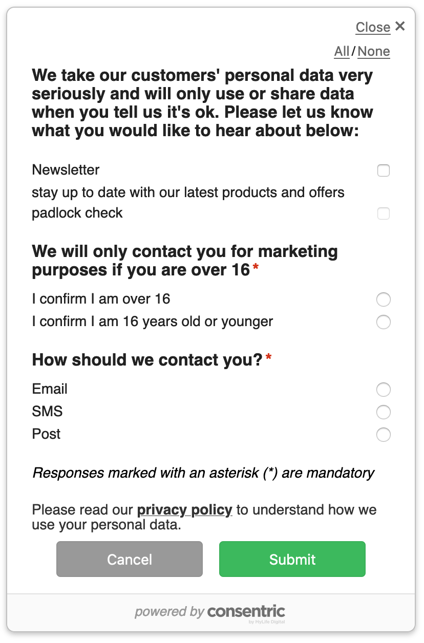
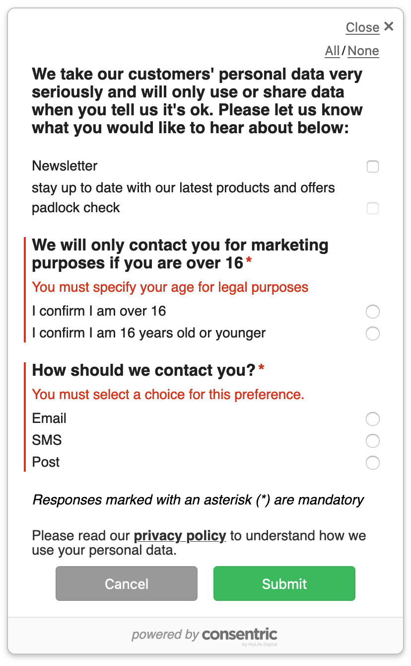
Add mandatory response elements
Within the capture point, you are able to establish mandatory response elements in the form of preferences. You should establish the relevant preference(s) with the available options, then create a ruleId using the rules UI. You can add as many mandatory preferences to the rule as you like, but successful submission of the capture form will be dependent on ALL mandatory preferences receiving a response. Once you have the ruleId containing the mandatory elements, you can apply this in the capture point configuration.
Error messages
In addition, you can store a custom error message to be displayed to the user (if not specified the message will show the default You must select a choice for this preference). These can be customised per mandatory preference to add more context if desired.
The below example shows one default message and one customised:
Use actions to hook into external events
Actions allow elements defined outside of the widget to interact and perform certain tasks normally managed by the widget. Actions can be triggered by calling either submit or cancel on the object returned by the load function. An example for common a use-cases is shown below.
submit- Submits the formcancel- Closes the form
Example
const widget = StatefulWidget.load(config);

document.getElementById('submit-btn').addEventListener('click', widget.submit);

document
    .getElementById('cancel-btn')
    .addEventListener('mouseover', widget.cancel);
If an error occurs while submitting, the error will be thrown by widget.submit(). This includes if a validation error occurred. The ValidationError object has a property called errors with the following format:
ValidationError.errors = [
    {
        message: 'You must select a choice for this preference.',
        details: {
            templateId: 'template01',
            blockIndex: 2,
            block: {
                // The content of the block
            },
        },
    },
];
Default styling and display configuration
applyDefaultStyle - boolean
The applyDefaultStyle attribute defines whether the default DataGuard styling should be applied. If set to false the browser will render the base html with no overlaid css. You can set the boolean to true and override specific elements (instructions here), or set to false and configure all styling elements (instructions here).
location - string
The location attribute signifies where the capture point will be rendered. Whilst users can update the css directly this gives an easier approach to embedding the capture point. If using any of these other than inside, the capture point will render as an overlay on the host page.
top-lefttop-rightbottom-leftbottom-rightcentre||centerinside(embeds the capture point within the page element as defined in the id within the cofig variables)
closeOnSubmit - boolean
The closeOnSubmit attribute signifies whether the form should close and display the success/fail message or keep the form in view and display the message above the capture point.
displayButtons - boolean
The displayButtons attribute allows users to hide or show the buttons based on a boolean value (e.g. where the submit will be tied to the host form submission).
displayCancelButtons - boolean
Same as displayButtons but isolated to just the cancel/close actions (e.g. set to false you will only display a single submit button).
displayAllNoneOptions - boolean
Same as displayButtons but targets the all/none options (e.g. set to true you will hide the ability to accept / deny all).
displayValueCards - boolean
The displayValueCards attribute signifies whether to show value cards when they are activated.
This does not affect the activeValueCard property which is added to the state object. If set to false, the value cards will not render by default when state is toggled, but you can use the onUpdate event to retrieve the value card text and render in your own way.
Tailor the default styling
The capture point default styling is set to show right-aligned checkboxes / radio buttons depending on the type of response being requested (see screenshot).
In order to help stop the capture point inheriting styles that may not be suited, the styling included with the widget is namespaced, with a prefix of mld-pc. To apply custom styling to parts of the Progressive Widget, simply use the correct selectors, add the style details you want, and add !important.
For example, to set the font, add the following to your page CSS:
css
    .mld-pc-app {
        font-family: Tahoma, sans-serif !important;
    }
The full css file is available for customers here.
CSS Selectors of Note
.mld-pc-app: A generic selector.- Can be used to set the
background-coloretc. This should be used sparingly, use the specific section selectors where possible
- Can be used to set the
.mld-pc-minimise: Used to style the save and close button text- Can set
colorof the text etc.
- Can set
.mld-pc-header: Used to style the content provided in the header- Things like
font-family, fontcoloretc can be set here
- Things like
.mld-pc-option-container: Used to style all permission options and preference choices.mld-pc-button: General styling for the "Submit" and "Cancel" buttons- Can set
border-radiusetc.
- Can set
.mld-pc-button--submitand.mld-pc-button--cancel: Used to style the submit and cancel buttons respectively- Things like
background-colormay be set here to change the button colors.
- Things like
.mld-pc-title: Used to edit the title text for each template block.mld-pc-description: Used to edit description text for each template block.mld-pc-toggle input:checked + label: Used to style the "checked" response- Setting
background-colorcan change the slider color etc.
- Setting
.mld-pc-all-none: Used to style the "All/None" options as a pair.mld-pc-all-none--all: Used to style the "All" option only.mld-pc-all-none--none: Used to style the "None" option only
Apply custom styling to fit host page branding
The full css file is available for customers who wish to take full control of all styling elements here. If you want to do this, ensure that the applyDefaultStyle boolean in the capture point config is set to false.
Updated over 1 year ago